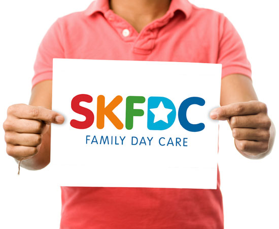
SKFDC
Product
Shellharbour/Kiama Family Day Care.
Task
Create a brand Logo that is vibrant and fun with solid and trustworthy undertones.
Our Strategy
The entity was being referenced as an acronym in spoken language so it made sense to do the same for this logo refresh. The logo is generally supported by the full text description when applied.
Outcome
As an existing entity in a competitive local market the refresh allowed for a complete revisit to the personality, values and perceptions of the organisation both internally and externally.
